Vivawang identity
Luxury candle brand rooted in Taiwanese temple culture, from identity to packaging to e-commerce.
End-to-end design for a candle company rooted in Taiwanese temple ritual. From strategy and positioning through packaging and e-commerce design.
Role
Founding designer responsible for all design work, with marketing and social media teams executing downstream.
Team
CEO, product designer, marketing manager
The challenge
Temple colors, symbols, and materials carry specific spiritual meaning. Red and gold for Tiger God references wealth and the Five Elements; the Mazu palette connects to her identity as a sea goddess. Design decisions had to respect those meanings while still working as a commercial packaging system.
The approach
Golden Tiger Temple (金虎爺) and Baishatun Matsu (白沙屯媽祖) each got a distinct system. Dedicated packaging, color, and scent profile shaped by each temple's character. E-commerce brought an older, traditional Chinese-only audience into the digital space with accessibility and cultural respect as the highest priorities.
Temple atmosphere, not temple decoration. Warm light against deep surfaces. Restrained composition with deliberate moments of gold. Traditional colors appear through material refinement: foil stamping, emboss depth, matte-to-gloss shifts.
Color palette
Primary
#194567
Secondary
#EBEEE8
Typography
Inner peace
Inner peace
Identity system
Candle-form W mark and refined serif wordmark. The color system maps to flame: ignition, glow, calm. Type sharp enough for foil embossing, soft enough for digital.
Five Elements · 五行
Every color, symbol, and material in the packaging traces back to something sacred. Taiwanese temples assign five colored tigers to the *Five Elements,* each carrying a specific color that directly informed the packaging palette.
Wood
Green Tiger
Fire
Red Tiger
Earth
Yellow Tiger
Metal
White Tiger
Water
Black Tiger
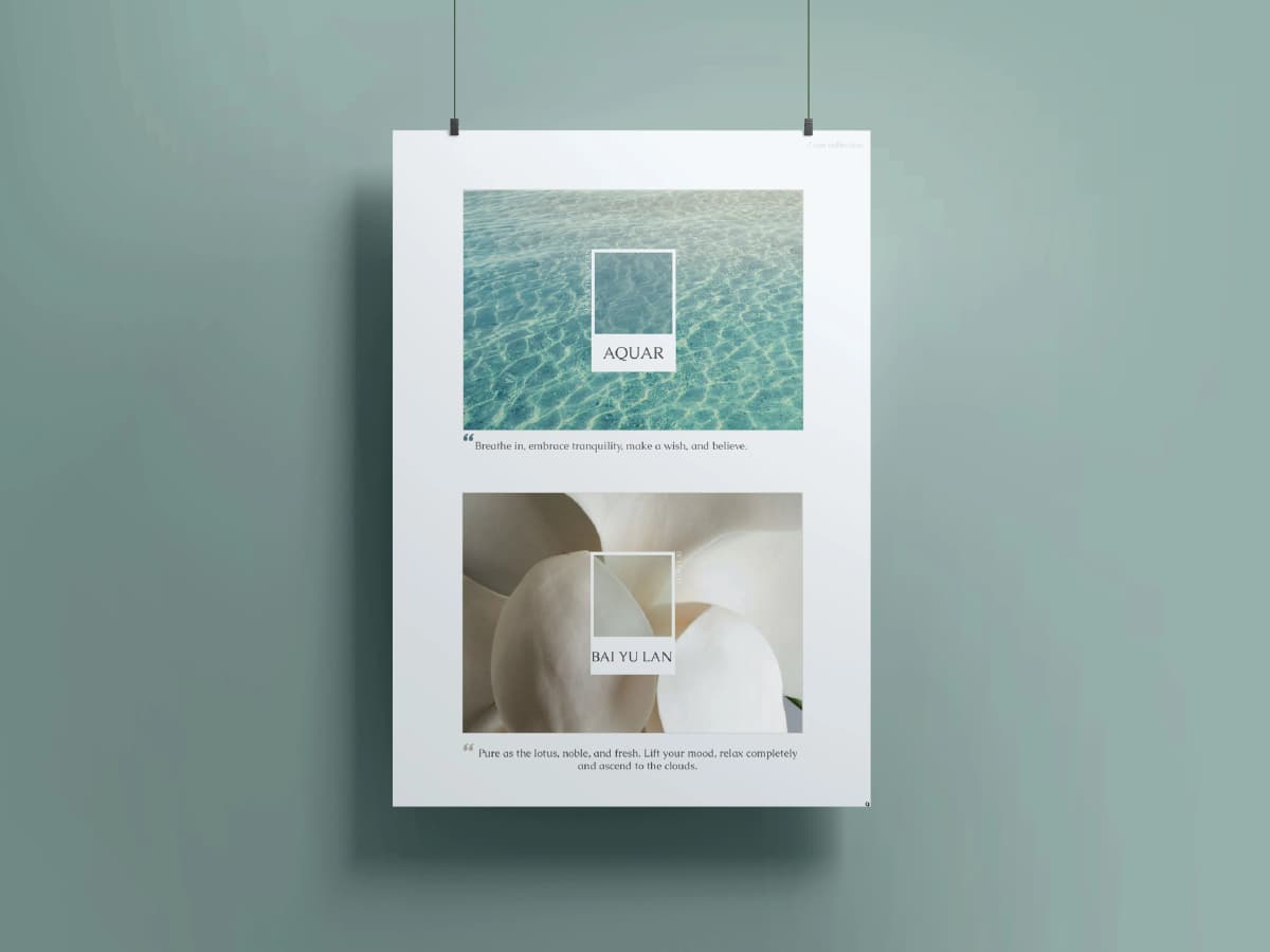
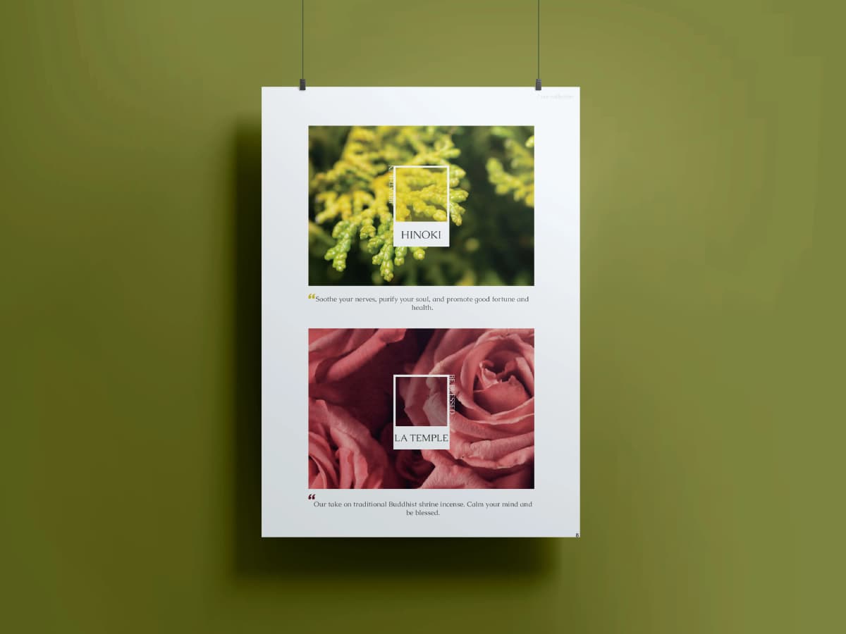
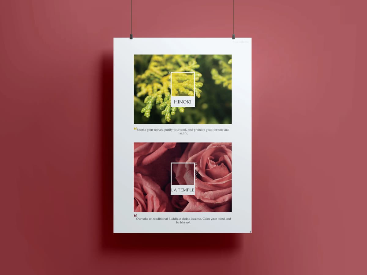
Golden Tiger collection
Two collections built around real temple partnerships. Golden Tiger Temple (金虎爺) uses red and gold with deep embossing. Baishatun Matsu (白沙屯媽祖) shifts to cooler tones with foil detailing. Every finish decision, foil depth, emboss height, matte-to-gloss ratio, was tested against the question: does this feel like the temple it represents?
Coins
Temple gold
Central motif across all packaging.
Incense
Offering red
Dominant color on ritual materials.
Tiger
Tiger orange
Trifold illustration centerpiece.
Pineapple
Shrine navy
Prosperity symbol on panels.
Baishatun Mazu collection
Baishatun Mazu is a sea goddess who protects sailors. The red robe visible from the ocean, the pink palanquin carried by thousands of followers, wave carvings on temple surfaces. Every element becomes direct packaging input.
Dragon
Mazu red
Left border illustration on all panels.
Ocean waves
Sea teal
Base pattern across every panel.
Palanquin
Palanquin pink
Central panel scene with devotees.
Phoenix
Ritual gold
Right border, mirroring the dragon.
E-commerce website
The website treats candlelight as the primary light source. Strict grid, controlled transitions, and enough whitespace to let the photography breathe. Product pages present information clearly without the clutter that most e-commerce defaults to.
- Challenges1/2
Temple partnerships meant every creative decision went through community leaders before production. The brand had to honor the source without losing commercial viability.
- Insights2/2
Copying a visual style is easy. Copying a real relationship with a 200-year-old temple is not.
Swipe to explore